|
Remembering Gwyther Irwin
Nick Wadley
 I
spent a lot of time talking to Gwyther in his studio, and being talked
to, about how his paintings came to be what they are. He was always open
and easily accessible with no pretension except in the form of games and
plenty of wit. I
spent a lot of time talking to Gwyther in his studio, and being talked
to, about how his paintings came to be what they are. He was always open
and easily accessible with no pretension except in the form of games and
plenty of wit.
Between the mid-1970s when I first knew him
well, and the mid-to-late-90s when the demon Alzheimer’s began to take
him away, his studio became a familiar world to me, as normal as
watching cricket with him. So familiar and normal that it’s only now,
going back to Tooting Bec after a decade and without him, that I can see
all over again just how eccentric and invented the abnormal world of his
‘formalist’ art was and is.
I remember asking him, early on, about what other art impinged on his
own work. He told me there was little of significance, consciously. If
he was enthusing about the dynamic formal energies that absorbed him, he
might mention anyone from Stuart Davis, to Audubon, to Uccello, but in
the formative years he was a relative innocent. He remembered an
inspirational visit in the 1950s to Alan Davie’s studio, but when people
like Lawrence Alloway or Ralph Rumney visited Gwyther’s studio in those
days, they often assumed references or received values that didn’t exist
in his art at all. These experiences inevitably nudged him towards a
greater self-awareness.
As part of the inventive generation of
’sixties artists in Britain, his work became compre-hensible within
avant-garde currents of the time, and for a while he was swept along by
them. He had three one-man-shows of his lyrical collages in London, late
1950s, was associated with the Situation group, and was then invited
into a succession of major group exhibitions world-wide. In the later
1960s, he was asked to carve a very large abstract relief for the new
London offices of British Petroleum. It was a bizarre commission and he
looked back on it as three years lost to painting. And then -- out of
the frying pan – in the following year, 1969, he took on the post of
Head of Fine Art at Brighton Polytechnic. He was to be there fifteen
years.
 During
the 1970s he took stock of where he was as an artist, and from this
point began finding his own eccentric path. By his own perspective,
that’s when he started to be a painter, and for the rest of us, this is
when his art ceases to relate to almost any other art. During
the 1970s he took stock of where he was as an artist, and from this
point began finding his own eccentric path. By his own perspective,
that’s when he started to be a painter, and for the rest of us, this is
when his art ceases to relate to almost any other art.
A series of 100 watercolours painted between 1978 to 1982 (pictures
below X3), witnessed his blossoming as a painter, and we are allowed
deep inside the process by a very frank ‘journal’ that he kept during
the painting of them. He described it to me as ‘all about failures,
about my bemusement’. The blow-by-blow accounts of each picture –
sometimes a paragraph, sometimes two pages – were usually written at the
end of a day. His despair about progress on the current picture is laced
with self-mockery as a strategy, and regularly gives way to high
elation. It’s a manic, often comic switchback. He mentions frustration
over time spent at Brighton, but mostly treats the constant problems of
making art at all. We gather, for instance, that the scribbling and then
typing of the notes is one way of escaping the knife-edge pains and joys
of painting, but then – in the next breath – that he paints all the
time, like a junkie after his fix, to escape the monotony of daily life.
This long, Woody Allen-like soliloquy mirrors the introverted, obsessive
world of the paintings themselves.
 If
the ‘100 Series’ was about learning to be a painter, it was an
apprenticeship of dazzling virtuosity, embodying both his meticulous
craftsmanship (as technician and colourist) and his instinctively
cavalier attitudes. However unlikely these bedfellows, it is precisely
their coexistence – needling each other all the time – that generates
the knife-edge on which Gwyther liked his art to be poised. It didn’t
need any other subject than this, absorbing his energies so completely
that he stopped playing poker. ‘The artist has a compulsive need to put
himself at risk,’ he said. If
the ‘100 Series’ was about learning to be a painter, it was an
apprenticeship of dazzling virtuosity, embodying both his meticulous
craftsmanship (as technician and colourist) and his instinctively
cavalier attitudes. However unlikely these bedfellows, it is precisely
their coexistence – needling each other all the time – that generates
the knife-edge on which Gwyther liked his art to be poised. It didn’t
need any other subject than this, absorbing his energies so completely
that he stopped playing poker. ‘The artist has a compulsive need to put
himself at risk,’ he said.
Towards the middle of the series, he
relaxed the vertical regularity of the marks, and at the same time
progressively eliminated the whites until all the colours touch, making
the surface a tumultuous display of jewel-like shapes. He even broke a
lifetime’s habit in number 47 and started from somewhere other than the
top left corner. His palette also changed, more sophisticated and
varied. He learned to over-paint colours if necessary, and took enormous
pleasure in holding his eccentric, changing colour harmonies in balance.
His blacks were never just black, always a mix of Payne’s Grey with a
choice of other pigments, depending on context.
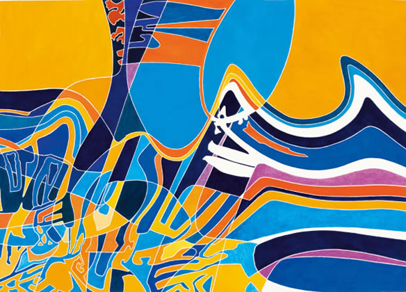
 From
number 48 onwards (eg no. 56 picture left), there appear more dramatic
changes, when the mosaic of similar elements gives way to an animation
of larger organic forms moving among smaller, implicitly background
forms. The dramatic re-introduction of off-blacks and the white paper as
dominant colours heightens the animation of the drawing, and reinforces
a new sense of depth. Twenty pictures later, the surfaces are full of
overlapping forms in space and he’s beginning to add associative titles,
some of them place names (eg Bondi Beach (picture below right). From
number 48 onwards (eg no. 56 picture left), there appear more dramatic
changes, when the mosaic of similar elements gives way to an animation
of larger organic forms moving among smaller, implicitly background
forms. The dramatic re-introduction of off-blacks and the white paper as
dominant colours heightens the animation of the drawing, and reinforces
a new sense of depth. Twenty pictures later, the surfaces are full of
overlapping forms in space and he’s beginning to add associative titles,
some of them place names (eg Bondi Beach (picture below right).
Since the early collages of the 1950s and
1960s, Gwyther’s work had often been linked to the landscape of the
north Cornwall coast where he grew up, and which remained his second and
natural home. While insisting upon the abstraction of his art, he
acknowledged submerged influences on his aesthetic of the movements of
wind, sea and sand; the flight of birds; stratifications of rock faces.
He knew that coast intimately all his life, was a prodigious swimmer and
a hungry observer of all visual phenomena.
 Now,
in the early 1980s, a quite different visual world started to inform and
then openly enter his paintings. ‘I’m beginning to suspect that some of
my imagery could come from television … I find myself watching what
could be my pictures flit across the screen.’ He preferred to watch the
screen on its side or upside-down, with the sound switched off. He
remembers watching an orchestra for hours: ‘Great shafts, dapples,
chunks, stripes, angles, curves and whorls of black white and raw
siennas.’ On another occasion, without recognising it, it was the
close-up view of a railway truck in a western: ‘Colour was sensational.
A great wedge of cadmium yellow … I couldn’t suppress a scream of
jealousy’ Now,
in the early 1980s, a quite different visual world started to inform and
then openly enter his paintings. ‘I’m beginning to suspect that some of
my imagery could come from television … I find myself watching what
could be my pictures flit across the screen.’ He preferred to watch the
screen on its side or upside-down, with the sound switched off. He
remembers watching an orchestra for hours: ‘Great shafts, dapples,
chunks, stripes, angles, curves and whorls of black white and raw
siennas.’ On another occasion, without recognising it, it was the
close-up view of a railway truck in a western: ‘Colour was sensational.
A great wedge of cadmium yellow … I couldn’t suppress a scream of
jealousy’
(December 1981).
He recognised similar qualities in the glossy magazines, Vogue
especially, and in advertising images at large. He became attracted to
an advertisement for Cadbury’s chocolate in Clapham, made a drawing of
it one day and hurried home to the studio. ‘Poster hoardings are my
gallery … rectangles as large as the Veroneses in the Louvre, larger –
full of dancing colour, amazing sometimes idiotic space … Everything I
see now is a picture, every photograph, everything on TV, everything in
nature. I have no idea what I’m going to do.’
What he actually did in the rest of the watercolour series was to make
paintings which gave ‘the strange feeling that I’m suddenly making “real
pictures”.’ The new compositions operate in a pictorial space, not
coherent necessarily but with overlapping forms and occasionally a
semblance of narrative order – in the last few, even with figures. It
proved to be a moment of transition, but brought with it an exhilarating
sense of freedom that lasted.
 Following
his retirement from Brighton, Gwyther embarked on a series of big,
energetic horizontal paintings in acrylic, some of which were shown at
Gimpel Fils in 1987, marking his return to the London art world. In
these, the innovations of the 100 Series were coherently digested into
his formalist world. They still include diverse quotations from other
worlds. Two recurrent motifs are a panama hat from a magazine and the
three crossed swords from David’s great painting The Oath of the Horatii.
The artist’s attraction to such ready-made elements was a lust after
their formal energies, and they are embedded into the pictorial dynamics
of the painting, often inverted or cropped, flattened into the surface.
He talked of these ‘real’ images as abstract forms. For me, a lot of the
character of the painting always obtained from the double identities as
image and form. The hat is still a hat. Maybe his disavowal was partly a
game of bluff. Following
his retirement from Brighton, Gwyther embarked on a series of big,
energetic horizontal paintings in acrylic, some of which were shown at
Gimpel Fils in 1987, marking his return to the London art world. In
these, the innovations of the 100 Series were coherently digested into
his formalist world. They still include diverse quotations from other
worlds. Two recurrent motifs are a panama hat from a magazine and the
three crossed swords from David’s great painting The Oath of the Horatii.
The artist’s attraction to such ready-made elements was a lust after
their formal energies, and they are embedded into the pictorial dynamics
of the painting, often inverted or cropped, flattened into the surface.
He talked of these ‘real’ images as abstract forms. For me, a lot of the
character of the painting always obtained from the double identities as
image and form. The hat is still a hat. Maybe his disavowal was partly a
game of bluff.
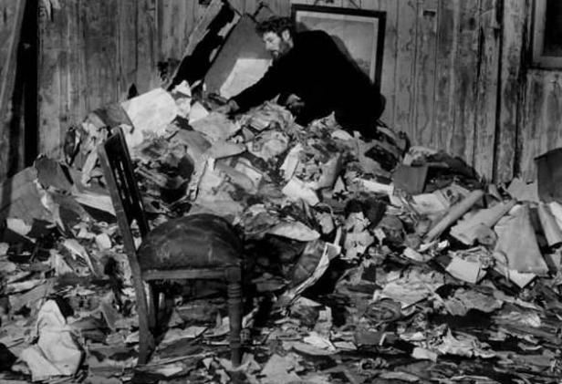
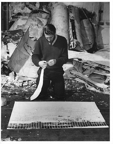
He prepared himself for the complex games of the 1980s paintings by
improvising maquettes. These were collages of cut papers, some pieces of
flat colour, some decorative, some photographic. They were small
collages, about 20 x 25 cm, squared-up for transfer. Another type (all
of which have disappeared) were even smaller. Fragments of image were
pasted on thin cardboard, cut and re-cut, arranged and rearranged, and
finally primitively glued together. Once the configuration was resolved,
its simple outlines were transferred to the canvas or paper in a light
pencil drawing, and the painting commenced in much the same way as in
the watercolours. The precise form and colour of each mark was ad-libbed
en route, as were the elaborately
polychrome pointillist textures he started to invent at this point,
inspired he told me by the screens of colour-printing. He was also
excited by the ‘electric’ double-edges of badly-registered colour
separations in the glossy magazines, and pirated those effects as well.
These animated effects gradually took the place of ready-made images and
by the end of the 1980s – unless you were very familiar with the
repertoire – the quotations became so scrambled or dismembered that they
virtually disappeared. This was largely because he now made his
preparatory collages out of colour-photos of his own work. In an
incestuous cannibalisation his previous images were cut up into vertical
strips, then shuffled and recycled into new and increasingly fractured
configurations.
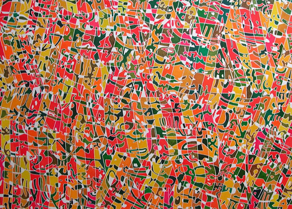
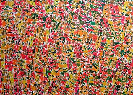
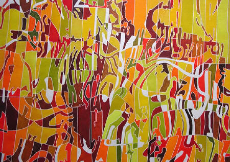
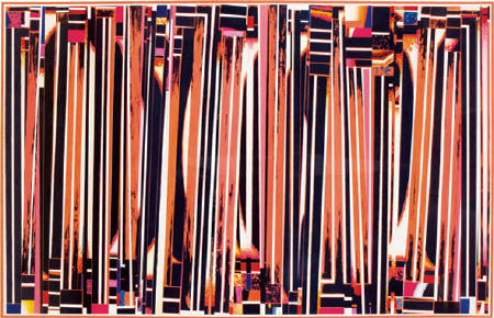 The
large horizontal compositions of 1993, pictures like Action Stations,
Holy Orders, Tiger Tiger (picture right), are crowded with vertical
forms, still animated by whites and blacks but clamorous, colourful
exchanges, with a sense of scale worthy of the poster. Everything
presses towards the surface in a very animated, but flattened space.
Even the edges, above and below the verticals are packed with rectangles
of striped or spotted colour, like flags or window boxes. There are
fleeting glimpses of space between the standing forms, but always
thwarted by another coloured form elbowing forwards. Gwyther likened
them once to a cocktail party or a conversation of forms. It is almost
as if his earlier ambition to ‘use real objects as abstract forms’ had
been turned on its head. The
large horizontal compositions of 1993, pictures like Action Stations,
Holy Orders, Tiger Tiger (picture right), are crowded with vertical
forms, still animated by whites and blacks but clamorous, colourful
exchanges, with a sense of scale worthy of the poster. Everything
presses towards the surface in a very animated, but flattened space.
Even the edges, above and below the verticals are packed with rectangles
of striped or spotted colour, like flags or window boxes. There are
fleeting glimpses of space between the standing forms, but always
thwarted by another coloured form elbowing forwards. Gwyther likened
them once to a cocktail party or a conversation of forms. It is almost
as if his earlier ambition to ‘use real objects as abstract forms’ had
been turned on its head.
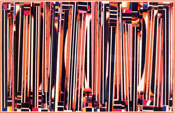
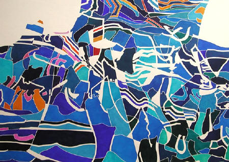
From these pictures lies a direct path to the large, majestic vertical
watercolours of the last years that we all know. These were composed of
horizontal tiers of vertical elements, one above the other on two,
three, sometimes even four levels. If that sounds familiar, it is. He
resumed the old practice of starting in the
top left corner, finishing each level as he went along...
I have only just seen his two last watercolours for the first time. In
their structure of descending ‘striated’ tiers, they are familiar. But
they have little to do with sunlight and are different enough in mood
and colour from the preceding paintings to come as a shock. The lilacs
and lime greens are more redolent of a Viennese interior – a boudoir,
perhaps – than of nature. Maybe the colours were inspired by a flawed
laser-photocopy? A surviving collage study suggests that this may be the
case. But Gwyther’s not around for me to ask what he was doing. I’m
reduced to approaching his work as archaeologist more than friend. On
the other hand, I also feel pleased to be left with this unexpected,
faintly perverse turn of events, which doesn’t put all of its cards on
the table.
excepts from an essay Nick Wadley, January 2009.
Gwyther Irwin was at Lemon Street
Gallery between 7th and 28th February
click below for full version of
essay
www.lemonstreetgallery.co.uk/gallery-exhibition-gwyther-irwin-esay.htm
|