|
Something New from
Repetition
Martin Holman responds to Kleiner Shames' 'Something
New from Repetition', Jupiter Gallery, Newlyn 22-27.8.22
The artist known as Kleiner Shames does not do autobiography. Rather
than travel inward for his material, his artwork deals with facts rather
than feelings. Shape, colour and space boldly dominate his compositions,
varied by shifting dimensions and types of surface. Shames looks towards
the world that surrounds him, its structures and vistas, at how people
interact with it and the traces they leave. He does not feel confined to
conventional places for placing or making his work. Inside or out,
public or private, settings might determine how Shames wants the world
to engage with him.
And ever-present in the fusion that typifies his vision are
skateboarding and graffiti, the subcultures which provided Shames with
the training ground for his visual awareness. In-keeping with the
kinetic spirit of that background, this installation at Jupiter Gallery
moves the visitor’s attention between wall and floor, canvas and board,
vertical and horizontal in its combination of painting, print, collage
and four sizable freestanding objects. Travelling between the different
dimensions, media and idioms are four graphic forms that tie the show
together by appearing and reappearing on the flat and in the round.
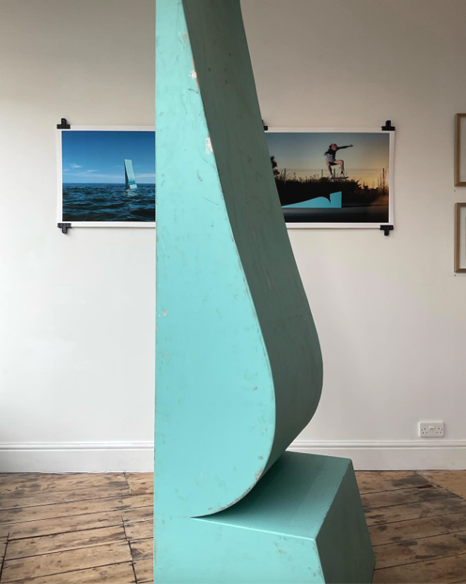
The most dominant form is embodied in the gallery by a tall triangle in
a turquoise shade of blue. Sitting on a straight-backed right-angle, it
conforms to an isosceles silhouette except that the third side acquires
a kink and curve on its way to the apex. Becalmed on the gallery floor
and rising above the height of any visitor, its geometry has been
fleshed out into a three-dimensional wedge.

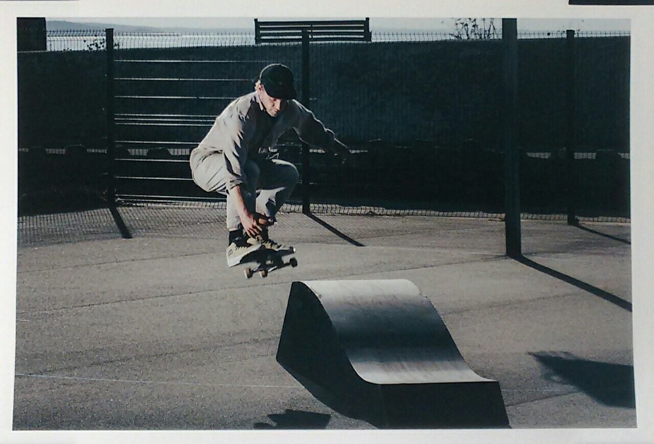
'Jimbo x Wavy
B', photograph by Andy Lawrence
Adjacent giclée printed photographs,
however, document the angular figure in other settings. In one, 'Bluey',
its given name, belies its body weight to given the impression of
surfing the current off Mousehole. A video loop projected on another
wall goes further to personify the shape in upright and reclining poses
like a fashion model against a plane grey backdrop before assuming the
ramp position. The photographs and video are the work of Andy Lawrence,
and Patch Plummer helped build the four sculptures. Shames is no
stranger to collaboration and to make this exhibition involved these
fellow freelance artists after being nominated by photographer Chris
Levine for a Kickstart award from John Studzinski’s Genesis Foundation.
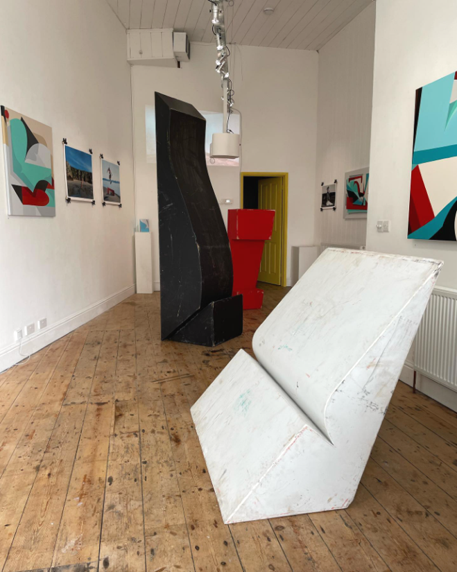
A theme emerges with the second shape, a chunky square bracket in
uniform red. This is 'Dom' and it sits in the gallery, upright this time
like a large dog begging for viewers to walk round and perhaps let it
rest its paws on their shoulders. In another of Lawrence’s action shots
it is seen crouched in bench-like mode as a skateboard passes under its
belly while its rider vaults over its back. The third shape in this
group of objects is 'Wavy B', all-over black this time and a variant of
Bluey but altogether less elegant. Divided between a belly-like bulge
propped in its upright position against a straight back slightly off-set
on a separate rhomboid block of black that acts as a base. The fourth
and last, a backwards leaning cousin of the blue and black wedges, is
white and named 'Blanche'.

Installation view, Jupiter Gallery, August 2022
The photographs propose an active life in the open, beyond the
supposedly passive, elevated setting of art and of the languages with
which art copes with incongruous structures. To underscore the contrast,
the objects do not enter the art environment in pristine condition. Or,
more accurately, scrapes and skid marks are part of their aesthetic.
Their surfaces are scuffed by the hard rubber wheels of skateboards and
the dirt of street tar and aggregate picked up in that external
existence. As such these sculptures create a context for viewing the
paintings and collages on the walls; inside the gallery they insert
themselves a little edgily into the way art is looked at.
Dom, Bluey, Blanche and Wavy B are the four shapes that correspond with
the interlocking forms that syncopate flat coloured facets across the
picture plane of Shames’s paintings. Having asserted a kind of autonomy
on the gallery floor and in the documentary photographs, they slip into
the paintings as anonymous elements. At first hard to read, they shed
their volume and are reduced to flat outlines to fill the roles assigned
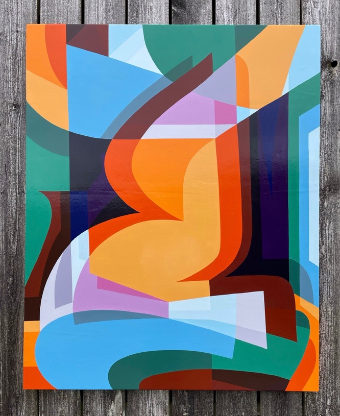
them in, for example, the painting called 'Four in a pile'.
The pile of the title is illusory: the surface of the image is
demonstrably flat. But that illusion suggests a viewpoint looking down
on contours overlapping each other in an interpenetration of curves,
gradients and angles. Where one edge is laid across, translucent like
decked sheets of coloured plastic, new colour-forms are made. The detail
introduces the idea that the stack might exist in space just deep enough
to accommodate the coloured layers. Internal tonal ridges also echo the
returns and kinks of the dominant areas to suggest simple spatial
relationships by shadowing their lines.
While the photographs imply function and
reality, the paintings represent no place that exists outside the
artist’s imagination. Here other properties are at work: how colour and
form are inseparable, for instance, seemingly conceived at the same
moment. Repeated so often, the shapes become a kind of basic language.
In the largest painting, 'Four close up', the repeated forms establish a
new choreography of line, colour, shape and space. The structures feel
more monumental: architecture comes to mind, the kind of future city of
massive, sleek lined constructions visualised by a theoretical
architect. No community could occupy these buildings. But they pack a
thrill all the same, the way that expressionist film sets (Fritz Lang’s
'Metropolis' or Ridley Scott’s 'Blade Runner') impress.

Big Bluey, wood
The eye scans the optical dynamism of these seamless surfaces to follow
the play between shape and colour. Shames does not make preliminary
drawings: his technique is more spontaneous than that. He relies on a
kind of cognitive muscle memory to deliver interconnecting frames that
bring colour and movement with them. He manipulates his readymade
language on a narrow chromatic scale, in keeping with the reductive
approach he now applies to all his work. Painting appears tightly
controlled around four dominant colours – red, white and turquoise or
light blue are almost standard, and he likes black as colour rather than
as a graphic device. At other times, idiosyncratic combinations come out
of yellow, orange and brown, or contrasting hues on the blue-red
spectrum that bring out purple, mauve and lilac.
The paint itself shows no sign of being worked. Instead, bands and
blocks feel detached from the hand, even mechanical, as if
screen-printed. Shames works professionally in two idioms that require
that impersonal touch. As a screen printer, he reproduces his own and
other people’s designs by in a methodical way to separate colours and
reproduce effects. As a signwriter, he is called upon to impersonate
print on vehicles and shopfronts. An old trade, it is highly visual and
iconic in its features; his four primary shapes derive from favourite
fluted serifs and effects. Shames took up the technique after his
initiation into graffiti while growing up in Oxford, and pursued both in
Bristol and London.
Those experiences established certain
traits that he has carried forward into what might awkwardly be called
his 'fine art' work. One is the taut and continuous arrangement of
diversified elements; another is the homogenous flow of pigment first
discovered with spray paint; and the third is an appreciation of scale.
In the last of these, Shames cut his design teeth on containing wide and
tall expanses of wall within the false symmetry of compositions built
around bold, blocky interconnecting forms. That evolved into tackling
the sides of houses. The distribution of a few colours across these
shapes not only gave spatial ambiguity to a level plane, it also set up
the perceptible visual energy that is establishing itself as a personal
trademark. A painting like 'Shadow leaner' allows the wedge shapes to
dance tight, interconnecting moves within set confines; images do not
spill out of the canvas but stay within physical boundaries. In this
case, the composition resolves into a kind of cubistic fragmentation; a
white circle seems to hold the interplay of geometry and colour, surface
and illusion in place like a thumb tack.

Combinate,
enamel on panel
Shames paints with enamels, thinning the medium to a consistency that
almost slides off chisel-headed brushes like a skin. It is possible to
imagine the hand of this painter gliding across a paint surface in
search of the same smooth move he might attempt with a boardslide in
skateboarding. Painting becomes a little performative, even if the
audience is not around to acknowledge the skill. Enamel as outdoor paint
is durable and lasting, and good against scuffing. The material keeps
faith with the artist’s inside/outside aesthetic and is equally relevant
to painting on metal as it is on wood or canvas – or the hull of the
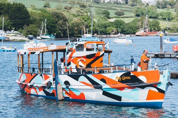
ferry boat that regularly crosses between Falmouth and St Mawes.
Because, in 2019, he was commissioned to apply a fresh look to the May
Queen to mark the 80th birthday of the craft (1939) as well as the 75th
anniversary of the D-Day landings (1944). With those commemorative dates
bracketing the most intense period of the Second World War, Shames came
up with a pattern of stripes, broken lines, curves and kinks in homage
to the abstract camouflage applied to vessels of the world wars known as
dazzle ships. Except that Shames’s eye-catching work had the wittily
opposite effect of making the boat unmissable at sea.

The May Queen
(2019)
The original concept for dazzle patterns came from artists recruited for
the British war effort. Shames is aware of the best-known contributor to
the project, Edward Wadsworth, a painter aligned with Vorticism in the
years around World War 1. The attraction of Wadsworth’s style to Shames
is obvious. Pictorially, Vorticism used clear linear, hard-edged forms
and unmodulated colour that was frequently independent of any
representational value. The style was objective and unsentimental,
properties apparent in Shames’s work, and reflected the energy
manifested in factories, popular music and dance. Fortunately, Shames
displays no sign of Vorticism’s bombast; in life and art, he is too
easy-going by nature for that to be a possibility.
Indeed, Shames’s art is something of an anomaly. His career has not
emerged through immersion in contemporary practice but from his
on-the-job attitude to the demands of street art, which evolves
organically through constant self-reference and technical development.
The process has been unforced and natural, learned on a practical basis.
The anomaly, however, arises from the affinity in his visual language
with the abstract tendencies in a historic phase of Modernism. Visible
in his gallery work and in murals around towns between London and West
Cornwall is a kind of synthetic cubism reminiscent of the 1920s that
highlights the sophistication of his intuitive sense of what works for
him. Art historians might be stopped in their tracks, for instance, to
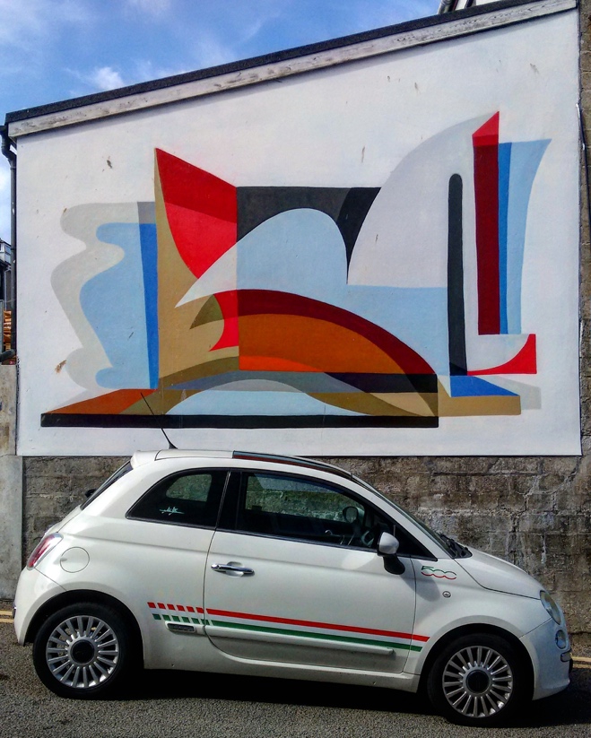
recognise shades of Amedée Ozenfant and Le Corbusier in Shames’s 2019
open-air mural in Penzance’s Bread Street; but those shades seem to be
there.

Bread Street
mural, 2019
The transition from street to gallery is not new: the figure of
Jean-Michel Basquiat is adequate explanation. Is Shames offering a type
of ‘skateboarder art’ for the hip collector? He is, and there is no
problem in that. But he offers more that fits into the historicist
strain present among today’s younger artists that are captivated by the
possibilities in hybridising the past and the present as a image of the
future. Brought up with the ubiquitous florid clichés of drips and
feathered spray trails recurrent in wildstyle graffiti paintwork, Shames
has detached himself from dependence on its most obvious tropes and
displays of superficial facility.
As he has gravitated away from overt figurative references towards a
more calculated, coherent and even rational framework, his shapes have
retained the essence of blocky and interwoven letter-based formats. Like
any contemporary artist, he has been subject to all manner of
influences, from spray art to advertising to design. He is probably as
voracious a consumer of imagery as he is a prolific producer of it.
Faithful to the honour code in street art about not copying another
artist’s work, he has submerged himself in a community of images – and
he expresses in galleries, on walls and in print the personal amalgam he
has created.
In that mix is an expression of the cultures he enjoys and, perhaps, of
the lifestyle with which its adherents identify. The abstract essentials
of colour, line and space are part of that, projecting a kind of ‘cool’
and energy in its vocabularies that is also found in their dress and
music. For the rest us, we will see echoes in them of genres known to us
individually. These do not diminish Shames but expand the ambience he
has instinctively come to inhabit. One similarity, for instance, is with
the Californian Hard-Edge pioneers of the 1950s. The flat, rhythmic and
chromatically pulsating non-objective canvases of Karl Benjamin,
Frederick Hammersley, John McLaughlin and Lorser Feitelson are barely
known outside the US. But the spirit they projected has become global;
they set up their studios in the Los Angeles area and helped define the
region’s distinct cultural environment. More familiar manifestations of
that environment to British audiences will be parallel West Coast
developments at the same time such as the jazz album covers of William
Claxton, the strolling sax solos of Sonny Rollins, sleek furniture by
Charles and Ray Eames and a way of living encapsulated in the
architectural photography of cantilevered steel and glass masterpieces
by Julius Shulman. From the visual artists, however, came paintings that
were elegant and reductive, like cool jazz in its reaction to the frenzy
of bebop. Traces of the hand were eliminated from integrated
compositions in acrylic or oil; analogies with music are inescapable,
with asymmetrical shapes and colours laid down like riffs in a jam
session to follow a vibe rather than an emotion.
When Hammersley spoke about his approach, his words could have been
drafted by Shames. ‘At first I would paint a shape that I would “see”
there… The next shape would come from the feeling of the first plus the
canvas… It just feels right.’ And somehow the relationship fits
supremely well. US Hard-Edge painting spread to New York once British
critic Lawrence Alloway used the term in the ’60s to describe American
geometric abstract painting featuring an economy of form, fullness of
colour and neatness of surface within an all-over arrangement of forms.
But Shames remains his own man with a place in the community that has
grown up around skateboarding since the Millennium, and in another (with
which it may intersect) in street art that cultivates mutual respect
among its practitioners. Both are as nationwide as any found in the art
world and all have their hubs in cities and towns. Where better, though,
for this reanimation of the West Coast spirit than in Penwith, where
British surfing took root on its coasts and the haze of the
counter-cultural idyll still lingers. For something new does come from
repetition.
© Martin Holman, September 2022. Martin Holman is a
writer based in Penzance. He is a regular contributor to Art Monthly and
the Burlington Magazine.
|

