|
Thoughts about the
art of Cornwall
A conversation between
Karel Spizer & Christopher P. Green
Karel Spizer: So Christopher, tell me, why did you move to Cornwall?
Christopher P. Green: The short answer is space. The long answer is
Alfred Wallis appeared to me in a dream and his magpie pointed its beak
to a blank postcard with a crude charcoal outline, which I understood as
one of Bob Law’s canvases, or a symbol of one.
KS: Were you interested in Alfred Wallis’s work?
CPG: Yes, I am, and have been for a long time now - the work and the
character. There’s a lot of, call it mystery, which surrounds him. To
explain what I mean (speaking consciously of the fact that in doing so,
as someone who clearly didn’t know Alfred Wallis but has read some, and
by no means all, of the literature published about the man, I am liable
to perpetuate and add to the myths) Wallis was a man who lived and
worked in St Ives Cornwall for most of his life; he lived in a very
small cottage on a lane behind Porthmeor Beach with his wife. He began
painting when his wife died, for company, and chose to live and work
downstairs only thereafter. The house is really very small, even by
typical Cornish village standards. One day, when working on some
paintings, with the front door ajar, two metropolitan dandies by the
names of Mr Ben Nicholson and Mr Kit Wood were holidaying in Cornwall
and happened to stumble upon Wallis’s house on their way to ‘The London
Tate Gallery’s Department of Outreach for Cornwall England’[1] to admire
some of their pictures - or possibly the beach, I can’t remember - when
Ben stopped to admire some of Wallis’s paintings, believing them to be
works of savage genius. Nicholson snapped up some of the small
paintings, made using boat paints and scraps of cardboard, and later
wrote to his friend Jim Ede of Tate Gallery London raving about this
painter he had discovered in the most unlikely of places, insisting that
he look him up and himself acquire some of his works. Wallis had no idea
about the Art World, in which these two upper class men were deeply
rooted, and was taken aback by their enthusiasm for the works. Wallis
was much older than his London-based admirers and was not particularly
interested in cultivating a professional career. He maintained a
correspondence with Jim Ede, who gradually amassed an impressive
collection of Wallis’s paintings, hanging them on the walls of his home,
Kettle’s Yard, in Cambridge England. Over the coming years Nicholson
would see to it that Wallis’s works were included in some exhibitions
along with his international contemporaries. Wallis remained in Cornwall
and was later admitted into a home for the poor where he subsequently
died, alone. His resumé of exhibitions, until a fashionable London
dealer took an interest in the artist and put together an exhibition in
2015, was slim.
KS: Thank you for that story. So what do you think about the legacy
of Alfred Wallis, now that you’re also living in Cornwall?
CPG: Well, I’m not sure who handled his estate when he died. I think he
had very little family around, where his wife had long since passed, and
they had no children. The works that Jim Ede bought now reside at his
Cambridge home, which is open to the public. Some other works pop up in
various auction houses; the asking prices, up until the aforementioned
dealer got involved, were always relatively low. I mean, it figures
though; Wallis wasn’t a professional artist like Ben Nicholson, who
would almost change his style of painting depending on what was in
fashion, and the history books had all but written him off as a naive
artist.
Now, I’m not going to try and make a case for Wallis, that’s not my
interest. I think it’s enough if people find out about him the way I
did, following their own curiosity. I went to Tate St Ives Cornwall many
years ago hoping to see an impressive display of his work only to find
one, or at most two, of his works hanging in a corner. I realised some
years later, possibly from speaking to my gallerist Hannah Barry who’d
studied in Cambridge, that Jim Ede’s house was the place to go if one
wanted to see Alfred Wallis’s work en mass. So I made the trip to
Kettle’s Yard soon after. As for Wallis’s house, it’s now a B&B, with
replicas of his paintings hanging on the walls.
KS: Oh, I didn’t know that. I’ve seen that house from the street.
Have you ever been inside?
CPG: Not in person, but I’ve seen the interior on the listing for the
B&B. This kind of thing is to be expected though, especially in St Ives,
which has been growing in popularity as a holiday destination, I think
ever since the decline of the local fishing industry during the
Victorian era. Maybe it would have been nice to have it preserved or
restored like they did with Barbara Hepworth’s micro citadel, but Wallis
didn’t seem to have anyone looking-out for him and his legacy. But
there’s a plaque and a comparatively more substantial monument to his
place in St Ives’s art history in the form of a tomb tiled with designs
by Bernard Leach in the graveyard adjacent to Tate St Ives. Last time I
checked, the former St Ives studio of Sven Berlin, author of The Dark
Monarch, had the window’s blocked up and was otherwise left to ruin - no
plaque there[2].
I did briefly have a studio on the same street as Alfred Wallis’s old
home, at Porthmeor Studios. I chose this studio over ‘Ben Nicholson’s
old studio’[3], which was also Patrick Heron’s old studio, out of a
curiosity for making work in a similar space to that which Wallis would
have occupied. The studio I rented faces the street, like Wallis’s
house, and has a single domestic sized window at each end; one looking
out onto the street, the other facing a courtyard, behind which is
Porthmeor Beach. The studio I had is the downstairs of a once
two-up-two-down house, with the dividing wall removed to make one long
room, which suited me well as I work flat and was able to have a line of
tables set up. I also organised a couple of events whilst I was there,
so I was using the street-facing window as a place to hang posters to
invite in passers by. Wallis’s paintings are all boats and the sea - he
was a painter of sea(e)scapes. What I find in the paintings is firstly a
sense of introspection. His house faced the street, he didn’t need a
constant visual reference to the sea in order to paint the sea.
KS: OK, so Wallis aside, because I think it’s important to say that
you didn’t move to Cornwall to resurrect the spirit of Alfred Wallis,
are you interested in the St Ives School?
CPG: You’re quite right. And that story remains open for edits. OK, by
the St Ives School, I take it you mean the painters like Peter Lanyon,
Patrick Heron, Terry Frost, Roger Hilton..? So I’ll answer that by
saying: some more than others, and not so much as a ‘school’.
KS: I think we’ve got some ground to cover here, so just before we
move on, I’d like to return to this idea of ‘paintings in corners’. For
example, I presume you saw the Mark Rothko work that was quite literally
stuffed into a corner at Tate St Ives?
CPG: Haha, of course, it’s so funny. I’m not sure if it was some kind of
inside joke between the art installers and curators. I really like it.
I’ve often mentioned it to people, and most people feel the same. It
seems to make everyone smile, and maybe for different reasons.
KS: Because they don’t feel like Rothko has a place in a gallery that
was effectively built to promote the legacy of the St Ives School?
CPG: I suspect some people, the nationalists out there, enjoy seeing the
high priest of American Abstract Expressionist painting stuffed into a
nook. Ok, sorry, I’ve got to say more about this nook itself, to provide
anyone who hasn’t seen it with a better visual: from my memory the
location is as one exits the final room in the original part of the
Tate, the one that feels uncannily like the low ceilinged galleries in
Peggy Guggenheim’s house in Venice - complete with an Alberto Burri work
too - just before the new extension starts, and just before one is
steered around into the atrium gallery, which is also not a thousand
miles from the Solomon Guggenheim gallery in New York, with its curved
walls. At this point, passing through an opening in the wall, you turn
and catch the Rothko painting. Hold on — there’s perhaps a whole thesis
which could be produced on this painting’s placement alone, so I’m going
to bow-out now. I’ll leave that to someone else to get stuck into as it
really isn’t my agenda, but nonetheless it’s probably one of the most
entertaining hangs of a work, especially when compared to the
reverential ‘Rothko rooms’ at Tate Modern. What the painting’s presence
alludes to - and perhaps at the hope of the painter Peter Lanyon - is
The St Ives School of painters’ connection to the canon of Abstract
Expressionism. Its stuffing into a crevice, segregated from the rest of
the artists, kind of suggests another reading..
With this in mind, and returning one of your previous questions of my
interest in the St Ives School (of painters), in terms of the
figureheads, the big names, my interest goes about as far as Patrick
Heron and Terry Frost for the following specific reasons: Heron’s
committed efforts to write about the work being made in Cornwall and to
fight for its place on the international stage, and of course those
late, great, garden paintings. With Frost, it’s largely his biography as
a working-class person making personal explorations through painting,
whilst trying to make ends meet financially; Frost was a soldier in
World War Two and later detained as a prisoner of war, the story goes
[4]. During his time as a POW he was encouraged to paint, and at the end
of WWII he returned to the UK, began to study art and soon after moved
to St Ives where he initially lived in a caravan, and worked a job
making sandwiches for holiday makers. At that time, St Ives then was
‘the place to be’ if you were an aspiring avant-garde painter living in
the UK.
I myself am from a working-class family. On my father’s side, I’m the
only person who received a university-level education. One of my
grandfathers was a prisoner of war for a number of years during the same
war as Frost, albeit in the far east. I’m the first of my family - on
both my mother and father’s sides - to call themselves an artist.
There’s a sense of relative humility to Terry Frost’s artistic career.
For Heron it was quite different; from a young age he was surrounded by
artists and he produced chic fabric designs for his father’s business
whose factory was located in St Ives [5]
I think it’s worth pointing out that most young people pursuing the life
of an artist at this time were able to do so because they had the safety
net of a family trust fund. You’ll even find accounts of them bemoaning
said stipends when they simply aren’t enough to allow them to sustain
the life of an artist. Class is something to be aware of when discussing
these life situations. I’m by no means saying someone from the
upper-classes cannot be an artist, nothing at all like that; like many
artists I’d much rather that this tiered system simply didn’t exist and
things could be levelled out. Art, after all, is not a competition,
regardless of how many prizes and awards continue to suggest so.
KS: I won't name names, but I think I know the artists you’re
referring to...
CPG: OK, but to be clear I’m not actually referring to anyone in
particular. This relatively unspoken issue of disparity between people
working in the arts isn’t limited to St Ives and/or Cornwall. And what
would even be the point of calling people out on it? The information is
already out there in the memoirs and biographies of countless dead
artists. It’s not as though the market for so-and-so’s art is going to
be (negatively) impacted by the public’s realisation of the fact that
their family’s money enabled them to travel the world, maintain studios
and organise decadent soirées during times when the rest of the world
were living in fear of bombs destroying their homes.
KS: Moving on from this, I dare say that when people with so-called
‘high-minded ideas’, and calling themselves artists, transplant
themselves into rural settings, they’re often met with hostility from
the local inhabitants.
CPG: Sometimes yes, sometimes no. I guess it’s subject to their level of
respect for their new neighbours and their willingness to share
something with them. Being mindful of what you can bring to the table,
and understanding that everyone has a role - or two, or three - in this
world. On that note, I should say that I’m also very interested in the
character and painting of Marlow Moss - radical at the time and, until
recently, pretty overlooked in the history books. This idea of feeling
threatened by ‘outsiders’ is what isolated Moss from the artistic elite
upon arriving in West Cornwall [6], and it’s a mindset that sadly
continues today among some artists here. Maybe it’s the artist’s ego at
play; this constant desire to be recognised as the most important
artist, who’s making the most ‘Cornish’ art? I mean, the same unhealthy
competition exists in countless major cities around the world, yet there
there’s more of them - hungry artists - and of course daily life has a
faster pace in these places and so there’s usually a greater sense of
potential in terms of one’s work finding an audience without having to
pander to legends of the locale.
KS: It’s easy to see the influence of the landscape in the art that
is made in Cornwall - that of both the past and present. Praise for the
light, and familiar tropes such as rocks, witches, and ritualistic acts,
appear commonplace. I don’t see these in your works. You mentioned Bob
Law at the very start. I can see more influence there. You mentioned
earlier that he made an appearance in your dream?

Bob Law
Drawing 10.5.59
pencil on paper, 25.3 x 35.5 cm, 1959, courtesy Richard Saltoun
CPG: Spooky stuff.. Well, Bob Law didn’t
actually appear, rather a work that I understood to be his. He died in
Penzance, and he spent some years, early on in his art career, in
Cornwall. I think he had a revelation about space and ‘minimalism’ when
lying in a field in Cornwall, which is where those ‘field drawings’ come
from. I suppose it could be said that he awoke there - artistically -
went away, and came back to rest. That was his life cycle - Cornwall was
the drivetrain. He’s often cited as “a founding father of British
Minimalism”. I can’t say there’s much, if any, sign of his legacy here
though, unlike, say, Hepworth, Nicholson, Lanyon, or Frost.
KS: Bob Law also fabricated some of Donald Judd’s sculpture pieces,
and you too have made furniture referencing Judd, albeit under the
pseudonym ‘R.Crudd’.

Christopher P. Green
Ronald Crudd MKI bench (short version)
salvaged plywood, varnish, screws, 2018-2022, courtesy the artist
CPG: Some years ago I made a toilet roll
holder for my old studio building that turned out to resemble a Judd
wall sculpture. I’ve since kept the ‘R.Crudd’ name going, occasionally
using it to author seating and desks for my exhibitions and various
other projects. The criteria is always simplicity of construction, with
pieces coming about via a process of up-cycling discarded materials.
It’s in no way an effort to poke fun at Donald Judd or his work. It’s
practical furniture, which I acknowledge and embrace as being Judd’esque.
KS: Would you consider yourself a Minimalist?
CPG: No, of course not. Are you asking because some of my paintings look
minimal?
KS: I was just curious. In terms of some of your paintings, and in
particular the ‘Between Together & Afar’ works, yes. In another
interview I read of yours from 2012 (with R.C. Sheering), you’d spoken
about Robert Mangold and Blinky Palermo..
CPG: In terms of Mangold’s paintings, the material similarity is that
the ‘drawing’, that’s to say the pencil marks, happens last - it’s on
top of the paint, as opposed to underneath it. Sure, both these artists
work/worked in series or in sequences - a continuation on a theme.. but
I don’t really see this aspect holding true for my BTAA paintings where
I see them as more of a group, a family - a set of relationships.
Palermo’s works on metal panels certainly got me thinking about the
potential for ‘objectness’ in otherwise very flat paintings. You know
the ones I’m talking about; I saw them for the first time at Dia Beacon
NY in 2012, after the fact so to speak, as I started making the BTAA
works in 2009.
When I decided that the sides would be painted, and in some cases the
back (when there’s a riser block fitted to them), I was trying to make a
more holistic painting. I’ve always been interested in the sides and
backs of paintings. When you look at the sides, of course you inevitably
find yourself seeing the front from a completely different viewpoint.
KS: I remember seeing the room of Agnes Martin’s paintings at Beacon,
an experience that further cemented my appreciation for viewing
paintings under natural light. Today, if I’m asked to look at a painting
under artificial light I always ask if it can be taken closer to a
window, or better still, outside!
CPG: That’s great! Ah, plein air.. yet here in Cornwall it’s more like
rain air!
KS: Coming back thinking about to your move from East London to West
Cornwall, and this need for space. What kind of space are we talking
about?
CPG: Head space.
KS: Could you not have gained head space in London, through
meditation or something along those lines of self-enquiry?
CPG: Perhaps. But even so, the city makes certain demands of people and
too often its currents carry artists in directions that are often not
healthy. Maybe they’re good for the ‘economy’, but often the art itself
is the thing that suffers. There are countless artists who’ve fled
cities, or, with those fortunate to have the means, keep one foot in the
city and one foot/studio somewhere outside - this has been going on for
centuries now. Of course there’s also lots of great and exciting art
being made in cities the world over, but I did what I believed to be
best for me and my work.
KS: So these new paintings, the large ones. Let’s talk about these.
Maybe we can start with the origins?
CPG: To an extent, they’re a continuation.. I first worked on this group
over the course of 2009 and 2010, making 32 paintings, and revisited in
2014, making a triptych. Seven years on from that and here we are: six
BT&A paintings, made in Cornwall. All the works are different yet
connected.
Lots of people see these works (the Between Together & Afar family of
paintings) as being very neat - which, ok, they are, but they’re not
‘perfect’. One person could read these works as hard-edge painting -
robust, yet they could also see them as subtle and fragile in nature.
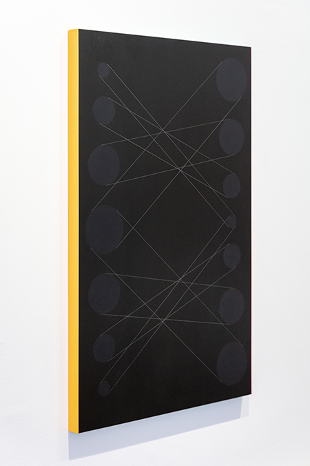
Perhaps it’ll help if I explain how I make them: I order large sheets of
birch plywood, I cut them to size, I make cradles and fix them to the
reverse of the cut panels. Then I begin the process of painting: sand,
gesso, sand, gesso.. Next the ground colour is worked out and applied to
the gessoed surface. After this I move onto painting the sides and top
and bottom. I then mark out the circles and mix the colours for these.
The colour of the circles is determined by combining the colour of the
central ground with that of the sides: the left side is mixed with the
central ground to produce the colour of the right circles, and the right
side is mixed with the central ground to produce the colour for the left
circles. The final stage is the drawing of the graphite line. I’ve used
the same brand and weight of pencil for all of these paintings, from
2009 to present.
KS: Looking at the paintings, I see what you mean in terms of their
subtle imperfection. I can also see that this is not a matter of fault.
The fact that one can sometimes see the grain of the wood, be it on the
face of the painting or the sides, reminds me of Charles Rennie
Mackintosh’s furniture; where at the bottom of a ‘perfectly’ painted,
and ‘perfectly’ square chair leg, one discovers a small section of
woodwork that is left far from ‘perfectly’ finished, save for its
immaculate paint work.

Charles Rennie Mackintosh
Detail of ‘Settle for the Dug-Out'
painted wood, cushioning, 1917
CPG: I’m pleased you brought this up.
Similar to the furniture from the Wiener Werkstätte too. As for Rennie
Mackintosh, I remember reading an account of some findings after the
fire in the library at Glasgow School of Art: the people clearing the
site discovered that a lot of the timber used in its construction was
actually of far less superior quality than they had previously assumed -
a lot of it was effectively timber that had been up-cycled from
shipyards. But I’m not sure what their exact reasoning for this was.. As
for my paintings, they could be made to look ‘perfect’; that is to say
their surfaces could be free of visible woodgrain or brush strokes, and
the circles could be computer precise - this is all totally possible
today.
KS: But they’d be lacking a certain degree of humanity?
CPG: Humanity, yes, and a level of honesty in terms of presenting and
working with the materials chosen. For example: if I wanted the
woodgrain to be completely unnoticeable this could be achieved by many
more hours of laborious preparation, or I could not use wood as a
support, and instead opt for a perfectly smooth surface to start with.
With these works I’m not striving to show the ‘hand’ per se, but of
course my ‘touch’ is there in the decisions made throughout their
production. Nor is this a celebration of the materials; it’s more a
matter of circumstance, as wood is, for me, available and workable.
KS: But I’m still curious: as you’ve been making these paintings for
over a decade now, have you noticed any progression in terms of their
refinement?
CPG: I’m not seeking to refine the paintings, I’m not practising
painting circles or drawing lines in between making them. Even though
the elemental structure and materials used are consistent throughout,
I’m approaching each one as if it were the first.
KS: With a beginner's mind?
CPG: A beginner’s mind with a long distance memory. I’ve always used my
human memory first over or, at least, before calling-on the printed or
digital memory, by which I mean photos of things or previous works.
KS: So, you use this ‘long distance memory’ when recalling previous
paintings and their respective colour schemes? One of your recent
paintings is titled BT&A (Brown #3) - Long Distance Memory, a very dark
brown, almost black, almost monochrome. Perhaps you can provide some
insight into this work.
Christopher P. Green
BT&A (Brown #3) - Long distance memory
acrylic and graphite on birch and pine panel, 112 x 70 x 4.2 cm, 2021,
private collection
CPG: Yes, I’m not trying to repeat, but if
I think to myself “I would like to make another red painting”, I don’t
see this as some kind of crime, because of course it could never be the
same as the previous red painting. This is why I prefer to call the BT&A
paintings a family rather than a series; they’re all related, but no two
are exactly the same. The recent dark brown painting is indeed almost
monochrome (viewed from the front at least), a quality I’m consciously
engaging with. So much so, that the circular elements barely make
themselves present at first glance. Who doesn’t love Monochromes? All
that pure colour. But this painting isn’t a single pure colour; the
ground is ‘Van Dyke Brown’ darkened further still with the addition of
‘Lamp Black’, and then the circles are a concoction of this and the
painting’s side colours; yellow-orange and soft pink respectively.
KS: These paintings are quite large, by your standards. I know you
tend to work mostly on small panels - a curious size - not too
dissimilar to say a notebook or paperback, or even an iPad.
CPG: Around the end of 2013 I said to myself that I only wanted to make
small paintings, and so arrived at the size you speak of; 24cm tall by
15cm wide. I had thought that I would stick to this as a kind of rule
moving forward. I mostly have. I’m not rigid though - although some
people no doubt come to the conclusion that I am when they see the BT&A
paintings. The, let’s call them, ‘small paintings’, were a way to loosen
things up at the time I made the first panels; I could throw all sorts
of ideas onto them and the set size would hold them together, so to
speak. I hear a lot of painters say they find small paintings difficult
to make, but for me I find the intimacy liberating.
KS: You usually work on multiple small paintings at the same time, to
prevent them from stagnating, or perhaps to avoid slipping into the
quicksand of doubt.
CPG: I try to keep between 3 and 5 going together at one time. I try to
keep them all moving. But I’m not rushing. Little good seems to come
from rushing something along. Some paintings come together, get figured
out, quickly - in a matter of a few days - whilst others take a few
years to get there. The small size is convenient in this regard whereby
I put them on pause, away in their boxes and let them sit for a while.
KS: Yes, I remember seeing these long crates in your studio, but I
had thought all the paintings contained within were finished works!
CPG: There are multiple crates, some containing complete works, and one
containing panels that are yet to find completion. I call them
‘complete’ but immediately find myself looking for a better way to
phrase what I mean...because none of them are really singular, having
come into being at the same time, always side by side with another work.
Now that I’ve been working with this approach to painting for some time
I’ve quite a few of these not yet understood paintings, so often I pull
them out further along in time and introduce them to ones I’m currently
working on, so there’s a past-present working relationship active in the
present.
KS: You’ve said before that your understanding of your paintings
fades over time, leaving works open for revision and reinterpretation.
Your perception of a work changes, placing you in a similar position to
that of the viewer seeing the work for the first time?
CPG: Yes, which is why I have a slight issue with this notion of
completion, or even understanding. Some of my favourite works of art,
historically speaking, are those I don’t completely understand. I don’t
subscribe to the seemingly popular opinion that art must be intently
pedagogical. Attempting to figure things out is more interesting - more
important - than being spoon-fed the answers.
Karel Spizer is a writer, musician, and
spiritual teacher. She is itinerant.
Christopher P. Green is an artist painter living in West Cornwall.
'Painting, come radon chime' by
Christopher P. Green was at Auction House, Redruth 20- 28 May, 2022. See
www.christophergreen.org.uk
for more info.
End notes:
1. Reference to present day Tate St Ives gallery. The gallery did not
exist at the time of Christopher ‘Kit’ Wood and Ben Nicholson’s visits
to Cornwall. It opened in 1993.
2. Next to toilet a block on Porthgwidden Beach, St Ives, Cornwall, UK.
3. Studio 5, Porthmeor Studios, St Ives, Cornwall
4. See, for example ‘The St Ives Artists: A Biography of Place and Time’
(book) by Michael Bird.
5. ibid
6. See, for example 'The lonely radical: Marlow Moss at Tate St Ives'
(article) by Lucy Howarth, Tate Etc. 25 June 2019.
28.5.22
|