|
|
| home | exhibitions | interviews | features | profiles | webprojects | archive |
|
Patrick Lowry on Auction House at the Auction House Patrick Lowry in conversation with Sara Bowler
SB: So why these works? PL: We spoke about Pierre Soulage and our shared experience of his work. I saw this one, Painting, 23 May 1953 (1953), on a school visit to the Tate, when I was doing A-level art and just got really excited by it, to the extent that I asked for a photographic print which I still have. I think what excited me was the space and depth created by the abstract brush marks. Interesting now, doing research into his other work, it’s this piece that I find the most engaging, other works don't seem to have the same magic. What stuck me when I first saw this work was the illusion of spatial depth, which I feel doesn’t exist in the same way with most of his other painting, I think this is a lot to do with the composition, with most of the works Soulage has made with these type of large brushstrokes they are all clearly contained with area of the canvas with well defined space between the canvas edge and the end of the bold black marks, so the image is contained, with my chosen work, the marks appear to go right up to and as if going beyond the edge of the canvas, implying a much more infinite space.
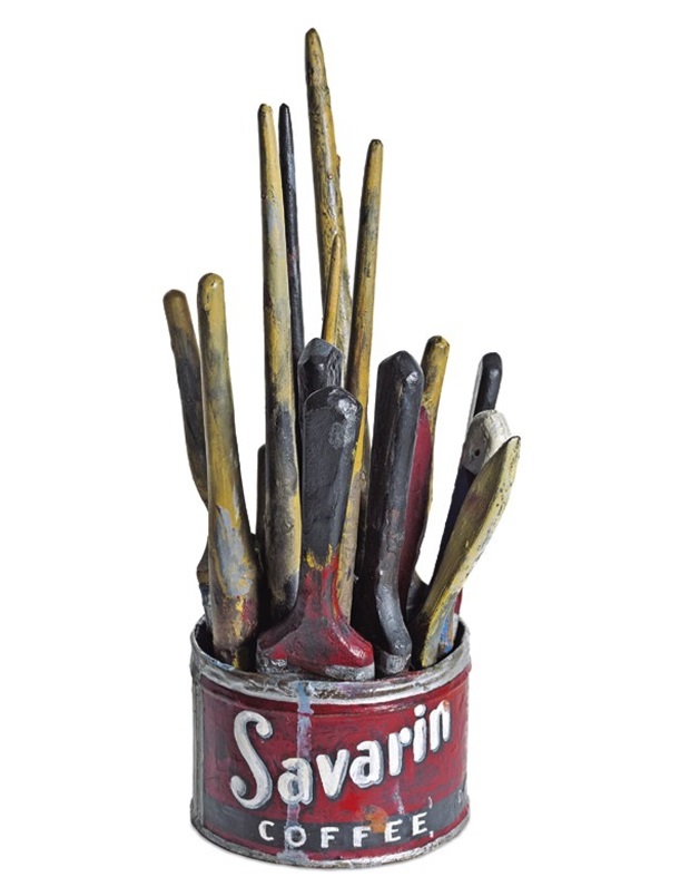
With Meret Oppenheim’s My Nurse (1936), I think my initial interest came about when I was researching the subject of readymades in connection with teaching. Again, it is this particular work of Oppenheim's that I really like above everything else she made. I’ve not seen it for real and I guess her furry cup and saucer are better known, but I feel this is so much more loaded with meaning, suggesting several layers of possible readings within the context of women in society. The immediate idea of the female as a piece of meat, trussed up and presented on a platter as something to be consumed, to give pleasure, hold your gaze and more, is revealed. The position of the shoes upside down, heels splayed apart, the reference is pretty clear, even the shape formed between the soles reinforcing the narrative with the shape of female genitals. None of this would have been an accident; Oppenheim was well versed in Freud. This is pretty strong stuff, particularly for 1936, to the extent a female spectator flew into a rage and smashed the original work when it first appeared at an exhibition in Paris. I feel slightly guilty that this is the only work made by a woman out of the nine artists I have chosen to represent. It wasn’t deliberate but I guess a reflection on the disproportionate lack of representation of female artists through most of the 20th Century. I think My Nurse, in terms of making any form of social comment, is by far the strongest of her works, and given this was made over 80 years ago, feels contemporary and relevant. Jasper Johns, Painted Bronze (1960 - image above) - Again, I’ve not seen this, but it seems quite relevant within the history of contemporary art. A replica of a readymade, made in the tradition of classical sculpture in bronze, then disguised as a readymade but with the clear hand of the artist revealing its inauthenticity. I like the idea that I’m taking it one step further in what seems a natural progression, a copy of a copy of a copy. Johns himself made numerous paintings, drawings and prints of the same piece. An apparently simple thing to make but finding paintbrushes the same as John's 1950's American brushes was problematic, involving a lot of shaping and sanding. Roy Lichtenstein, M-maybe (1965) - I remember seeing an exhibition of his work at the Tate when I was doing my art foundation course, and it just felt exciting and very current. His work has become a bit clichéd and over reproduced now, but in a way there is an interesting irony to this, Lichtenstein making copies of mass produced low value cartoon images - now there are mass produced low value reproductions of his high value art works. What I like about trying to reproduce his work is recognising how sophisticated the image really is. I chose this piece in particular because of the narrative, which I feel somehow relates to our present pandemic situation. Although I make predominately three-dimensional work, it’s often the work of painters or artists using photography that I’m most drawn to. Edward Hopper is an interesting artist in that his work is easy to like and very popular with a broad audience, but lots of artists and film makers have referenced or been influenced by him, Jeff Wall, Jean-Luc Godard, Hitchcock, John Huston and Victor Burgin. I suppose my general interest in Hopper is his portrayal of architectural spaces.
I’ve wanted to make a work based on Hopper’s painting Gas (1976 - image above) for several years. When Hopper painted it, it seemed to represent a romantic notion of the road trip, travelling by car across America, the petrol driven auto industry offering freedom and mobility to new middle class Americans. Now the same painting has another poignancy, the petrol station at twilight, the twilight of a century of the love affair with the petrol engine. And the realisation of how devastating this love affair has been on the planet. The accompanying replica drawings give an interesting insight into Hopper’s working method showing that his paintings often represent a fabricated reality, there never was a petrol station that looked quite like this. There is a nice link between Hopper and the work of Victor Burgin, although two quite different genres and different periods, Hopper representing more traditional figurative painters, Burgin in many ways typifying the more conceptual, but some nice overlaps around subject matter, particularly the office environment. I was originally going to reference Burgin’s Office at Night, but practically, mainly because of its size, decided to find an alternative piece that I thought would work in the space. There are two pieces Basilica 1 and Basilica 2 that formed part of a commission by Canadian Centre for Architecture, Montreal. Voyage to Italy (2006), was made in response to an album of photographs of the Basilica in Pompeii from the museum archives. Because of the pandemic, travel has been out of the question, so I decided to visit the Basilica virtually, touring the space via Google Earth and the hundreds of tourist photographs posted online. It is a selection of these found images that I’ve used to represent Burgin’s work, not his original images, to construct my own virtual tour of the building, in a way referring back to Burgin’s starting point of a found 19th Century photograph from Pompeii. When Google Earth first appeared I was really amazed by it, and still am, the fact that you can pick virtually anywhere on the planet and go there on your computer, walk down a street, look at the shops, the houses, the trees, almost as if you were there. Yves Klein, IKB79 (1959) - I guess this is more of an intellectual choice. Walking around the Tate in the ‘60s and ‘70s I’m sure there would have been a Rothko, a Pollock, a Stella, an Albers, at least one slashed Fontana canvas and a Klein; all those blokey artists, so in a way I felt his work is a good representation of mid 20th century contemporary art. The Klein seems to be a good fit for this collection and it is a great colour. The original isn’t one flat tone so I ended up spending quite a bit of time trying to match the nuances.
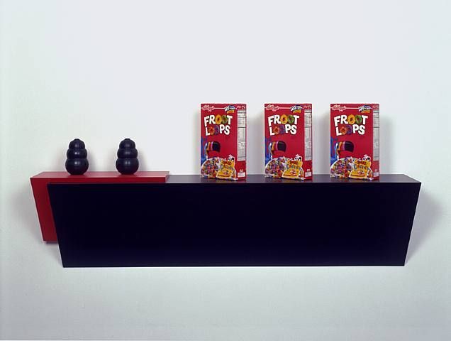
I chose Haim Steinbach, Froot Loops (2008 - image above) because of my enduring interest in the readymade. There is of course a long history of this, I guess starting with Duchamp, and lots of artists have explored this way of making artworks, the Oppenheim being a good example. But what I think is interesting with Steinbach is how he has really pushed the idea of presenting found, everyday objects as art, objects one could relatively easily just go out and buy in the supermarket. By presenting them in very particular ways, juxtaposing groups, the use of multiples, carefully placing objects on purpose-made sculptural shelves, he elevates their status to art. There is a lot in the works relating to our contemporary, consumer-obsessed lifestyle, with a bit of interior design and home making thrown in. I guess there is something in my interest in the qualities of mass-produced objects that initially took me down the product design route when I started out. Of course, like the Johns, actually finding the exact objects he used proved to be more elusive than I first thought. The Kong dog toys were an easy web purchase, but Kellogg’s Froot Loops are peculiarly American, and they have revised the packaging since Steinbach made his work in 2008. I ended up sending Kellogg’s design and marketing team a picture of the Steinbach, to see if they still had the artwork for that year’s Froot Loops packaging, which luckily they did, and kindly sent me a copy for me to reproduce. I kind of like these odd interactions, connections and links that come out of research when making the sort of work I do. I’ve always liked Gerhard Richter’s work, probably the more photoreal paintings. I’ve read quite few of his interviews, and what I particularly liked was the fact that he would change his ideas about what he was doing, showing a real uncertainty at times. I’m always suspicious of artists who are totally confident in what they are doing, so I was keen to include him. I felt the photoreal images were too obvious a choice and then I came across the work I have replicated, Abstraktes Bild, Abstract Painting (1976), in an old Sotheby’s auction catalogue when I was trying to get a feel for the high-end auction aesthetic. It felt like a quite modest piece, which I don’t think has ever been exhibited, with the only other reference I could find to it being in the Richter Catalogue Raisonné.
SB: So how do you see all of these works fitting together? PL: I’ve been thinking about the whole project and would like it if there was an understanding that all of it - the facsimile works, the catalogue and the auction - as all one work, Auction House, so if people buy an artwork they are buying just a piece of the whole and in turn, have become part of the work by bidding and buying. In fact, anyone who just registers to bid becomes part of the work. Sara Bowler is an artist living and working in Cornwall. See 'exhibitions' for installation shots of 'Auction House' (2021).
https://www.auctionhouseart.co.uk/ https://www.axisweb.org/p/patricklowry/
|
|
|